Process mapping is a fantastic tool used in improvement projects. It provides the stakeholders with a visual representation of workflows and activities, and it allows the improvement team to make informed decisions about improvement plans. The process map is also the perfect document for starting a factory simulation, it shows you how all the activities are linked together, the workflow and information flow.
What is process mapping?
A process map, also known as a flowchart or workflow diagram, is a visual representation of the series of steps that make up a process or system. It should have a clear start and finish. The start and finish should be linked by clear steps. The granularity* of each step depends on what you are trying to achieve with the process map. Sometimes it is important to map each button pressed as a separate step, other times it is better to combine all the button pressing into one step. There is a balance to be achieved between level of detail, unwieldiness of the map, and what you are trying to accomplish. The map may also contain decision points, which can send workflow in different directions.
*‘Granularity’ is not a word I had experienced before in process improvement. I first came across the term at a simulation conference. I think it comes from the data sciences (I’m sure others could tell me). Anyway, it is the perfect way to describe what level of detail is being captured.
How do I gather data for a process map?
The best way is to ‘walk the line’, that is following the work item* through the process you are mapping. Making notes of every step it goes through, including movements, waits, and decisions. You can then make a tidy process map when you get back to your desk. The second-best way is to sit with the process owner and a pile of sticky notes. Write each step on a sticky note and map it out on a large table. The beauty of sticky notes is that you can move them about as you realise you have missed a step or got things back to front.
When you are process mapping in a team, you need to make it clear what you are mapping at the start. Not just where the map starts or finishes but are you mapping the actual process (warts and all), the ideal process (how it should be working), or a future state (what you want the process to look like). I’ve been in mapping sessions where different people are working on actual, ideal and future states, and it was a mess. If you are attempting to create an ‘actual’ process map and people keep insisting on saying what should be happening, then use different coloured sticky notes for ‘ideal’ or ‘future’ states. It helps keep everybody happy, the session moving, and importantly gives you an accurate process map.
*The work item is the thing you are processing, it could be an item, material, information or even a person. I’m not sure patients like being referred to as work pieces, but from an operational perspective that is what they are.
How do I present a process map?
There are number of different icons used in process mapping. Each denotes a different type of step. Here is a list of the key ones:
- This is the start and end of the process, and they are represented by an oval.
- Process steps. These are individual steps in the process and are represented by a rectangle.
- These are where choices are being made, such as pass/ fail. They normally have at least two arrows routing out, indicating the route determined by the decision.
- Arrows link up all the process steps, they depict the flow of the work items between the steps. Solid lines normally represent movement of physical items whilst dashed lines represent information flow.
There are other symbols that represent documents, data, sub-processes and delays, but I’ve never found a reason to use them. An example of a process map structure and the standard icon shapes are shown in figure 1.
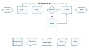
Figure 1. Example of a process map structure and symbols.
A similar and complimentary document to a process map is a process flow diagram.
Process flow diagrams (PFD)
A process flow diagram is used in the process and chemical industries. It shows how equipment is connected and the flow and direction of material within the system. It shows all the important equipment for a system including for start-up, shut-down and safety. Care should be taken when using a PFD, as it shows how the equipment is connected but not necessary the process steps.
If you have a copy of the PFD, then get the process owner to talk you through the operational steps of using the equipment, this will be the process map. Together the two documents are very useful, but don’t fall into the trap of using the PFD as the basis of a discrete event simulation, unless you have a clear understanding of how the equipment works.
Discrete event simulation is about how events are interconnected, not how equipment is connected. For example, you may have two vessels connected, but there may be a dozen activities that take place before transferring material from one to another. The simulation needs to know about the series of activities, as to the simulation the vessels are just resources. The same goes for your process map, it should chart the series of steps that makes up the process. This is why I think process mapping is essential before starting any simulation project.
Validating your process map
Once you have a draft process map you need to validate it. There is nothing worse than making decisions off a process map to later find out that it was wrong, and then you have to go back to square one. This goes double for creating a simulation from an inaccurate process map. If you are ‘unlucky’ you can bake in the mistakes with lots of programming, and then it becomes very difficult to unpick the mess.
To validate the map, you can ‘walk the line’, checking off every step that the work item goes through. Or, if that is not possible, talk through each step with the process owner. You are checking that the steps are in the correct order, and that there are no ‘obvious’ steps that have been overlooked.
At this point you might find that there are exceptions to the normal rules, certain work items may require different steps, or work items that fail a quality step get sent in a different direction. It is worth recording this information, but you need to make a judgement call to whether this is relevant to your project. Identifying what information is relevant and useful to your projects should always be referred back to your project goal. Does that level of detail help me achieve the project goal? Or does it just get me bogged down? I’ve written elsewhere about the importance of setting the project goal. You can read it here.
Recently, I’ve been creating a quick model of the process map, just using rough timings and no coding. I’ve found that some process owners find it easier to review and validate the process map via a simulation. They find it easier to spot mistakes in a dynamic representation instead of a static bunch of boxes. An example of this can be seen in video 1. Now the process owner can see how the information from activity 4, triggers an action at activity 1. The dynamic visual representation makes it much easier for process owners to validate the process map.
Video 1. Simple simulation of process map from figure 2.
Anyway, getting it right here saves you a lot of time and effort. Finding mistakes in the base data later in a project can mean a lot of rework- which means extra time and effort.
Other useful variations of a process map
There are a few useful variations of the process map, I’m not going to discuss them in any detail but it is worth mentioning them.
Swim lanes- This is where you add columns or rows (swim lanes) to your process map. The separate swim lanes denote different areas of responsibility. When the process steps cross into a different swim lane it means the work item has shifted ownership to a different person, room, department etc. This can be a really useful variation, and I probably use this in a third of my process maps.
Value stream mapping- This is a different way of representing a process. Generally, they are reserved for the production processes, i.e., the process that creates value. They cover the process from supply of raw materials to shipping of finished goods. They capture timings, capacity and other operational performance data. Personally, I don’t like them. For them to be useful they become too complex. Trying to read one is like trying to do dynamic calculations in your head. However, I have colleagues that do like them so they must be useful in certain situations.
SIPOC diagram- Identifies all the important elements of a process. They define the supplier, inputs, process, outputs and customers. This is great for analysing processes, and sometimes the act of creating a SIPOC diagram, highlights obvious issues. I’ve talked about processes and SIPOC diagrams in more detail in a different article. You can read it here.
Next steps
With your validated process map you are now ready to move on to the next stage of your project. The section below covers a number of benefits from generating a process map.
If the map is going to be used to support the creation of a simulation, you need to start adding the relevant information to each step. This could be the resources required (equipment, people, tools), the materials and energy consumed, waste products, timings (cycle times, change overs etc.), and any decisions made.
Benefits of process mapping
Process mapping is one of my favourite process improvement tools. I use it in every project. Here are some of the reasons I love them so much:
- They can be used to clearly present complex processes.
- It forges agreement between all stakeholders of how the process works and should work.
- Identify improvement opportunities.
- You can identify clear ownership of all the process steps.
- You can identify areas where quality is at risk.
- They create simple documentation of a process.
- They communicate process clearly and quickly with stakeholders and new starters.
- They are a great tool for process design.
Now if you create a simulation from the process map, you get all this and more. Some bonus benefits are:
- Dynamic visual representation of the process.
- Powerful process analytics.
- Scenario testing.
- Change testing in a virtual environment.
- Charts resource usage. Including calculating operational costs.
Do you want to get more out of process mapping
Process maps are a valuable tool in process improvement, but their potential extends beyond documentation and analysis. When leveraged to create simulations, businesses gain the ability to experiment, refine, and innovate within a controlled virtual environment. This approach empowers decision-makers to make informed choices, reduce operational risks, and ultimately achieve operational excellence.
If you would like to embrace the power of simulations, and watch your business grow. Then check out our Simulation for Improvement webpage or get in touch to make it happen.
Image by IMG2GO.com M.C. Escher style drawing of a factory.