
Sometimes there is too much to do, and it all gets a little overwhelming. Even after going through your list of jobs and weeding out all the non-important tasks, there is still too much to do. This is where the 80-20 rule or Pareto principle comes in. It states that 80% of your outcomes come from 20% of your inputs. This is not an accurate mathematical description but a useful rule of thumb for helping you prioritise your actions. The idea is that you focus your efforts on the activities that achieve the highest rewards.
Where did the 80-20 rule come from?
Vilfredo Pareto was an Italian economist, sociologist and philosopher. He applied mathematical tools to economic analysis. In 1906 he demonstrated that 20% of Italians owned 80% of the wealth. The study has been applied to other countries and the 80-20 relationship has been found to hold roughly true. After his death in 1923 this ratio was found to be applicable to other circumstances outside of economics. Dr Joseph Juran is credited with developing the concept in quality terms and devising the term Pareto Principle.
The Pareto Principle has many useful applications but the one we are interested in is building an effective non-conformance system in conjunction with Stratification of Data and Pivot Charts.
“In quality management, a nonconformity is a deviation from a specification, a standard, or an expectation.”
When can I use the 80-20 rule?
This rule is employed in a lot of different disciplines: Sales, Economics, Health, Safety and importantly for us Quality. In each case they are trying to find which of the 20% of inputs results in 80% of the outcomes.
If you apply the 80-20 rule to your Sales, you might find that 80% of your income comes from 20% of your clients. Of course, this will not be precise and heavily depends on the type of business, but it has been found to be true for a lot of businesses. When you analyse your sales, you might find the relationship is 60% of your income results from 25% of your clients, or 90% of your income results from 15% of your clients. The second scenario may set alarm bells ringing as your business is reliant on just a few clients. Either way understanding which are your key clients will help you set priorities.
Pareto Chart
The Pareto chart is one of the 7 basic quality tools that was introduced and made popular by figures like Edward Demming, Joseph Juran and Kaoru Ishikawa during postwar Japan, during the rebuilding of Japanese Industry. The Pareto chart is a histogram (bar chart) of inputs across the bottom (x-axis) and frequency of occurrence on the side (y-axis). The frequency of occurrences are sorted from left to right, with the highest frequencies on the left. Overlaying the histogram, is a line graph showing the cumulative frequency-of-occurrences measured in percentages. So, if the Pareto Principle stands then 80% of the cumulative occurrences should be the result of 20% of the inputs. An example of a Pareto chart can be seen in figure 1. Here we can see that the three main issue types are: 1) Delay from equipment failure, 2) Quality from incorrect parameters, and 3) Delay from damaged items. These three issue types account for more than 80% of the total issues.
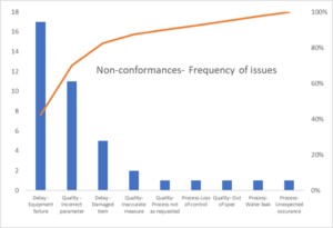
Figure 1. Example of Pareto chart, plotting the frequency of non-conformance issue types
Using the 80-20 rule in Quality
If you find yourself in charge of a poorly controlled process, you will probably feel that you spend most of your time firefighting. There will never be enough time to deal with every reported non-conformance. It is quite tempting to stop recording issues and just deal with the most pressing crisis. However, it is still worthwhile recording every instance as you can use it to plot a Pareto chart. Once you have the Pareto chart you can identify which types of issue cause the most problems. You can then focus your efforts in resolving these few key issue types.
It is often difficult to make the first breakthrough, it requires focus and discipline, and quite often a bit of luck. The trick is to ensure you identify and fix the root causes of the issues, this is a huge discussion area in its own right and we will cover it in a future article. Don’t lose faith if you do not feel that you are making progress. You will inevitably have false starts and find yourself going down dead ends, but this is just part of the learning process. Each ‘failure’ will result in better understanding of your processes.
If things are really bad, you might have to resolve a number of issues before you start seeing improvements. When you clear the first set of issues, you should find that new issues become part of the 20%. This is normal and part of the curve, the thing to remember is that the frequency of non-conformances should start to go down. You know when the system is working well, it is when you start opening up the definition of your non-conformances to try and capture more.
Don’t neglect the 80% of inputs
When you start making real progress there comes a time to start to look at the other 80% of the inputs and pick off any easy or high priority issues. Joseph Juran referred to the 20% as the vital few, and the remaining 80% as the useful many. At this point you should be beyond the regular firefighting and so should have more time to investigate all non-conformance reports. You can then prioritize issues that align with your process improvement targets, for example ones that cause delays, defects or increase costs.
An alternative approach is to try and look at your reported non-conformances in different ways. To do this you need to use multiple classifications for your non-conformances. You can then create Pareto charts using these different classifications.
Stratification of data
Before collecting non-conformance data, you should think about the type of questions you may want to ask. Then make sure that your non-conformance occurrence form contains all the relevant classifications. Data stratification is the process of partitioning data into distinct or non-overlapping groups. For example, you may partition health data into male and female patients. For Quality information you will be interested in the who, what, when, why and where type factors. Who? could be the operator or department. What? could be the product type, process, or defect category. When? could be the day, month, season, or year. Where? could be the site location or equipment system. Why? could be the causation category. Just remember to only collect data if you think you are going to use it. Otherwise, you are creating additional bureaucracy, that will become a barrier for the people you want to complete the forms.
Pivot Tables & Pivot Charts
If you create a table of your stratified data in Excel, and get the formatting correct, you can use the PivotTable and PivotChart functionality. The master table needs to be complete, no blanks cells, with the headings across the top. An example of a non-conformance table can be seen in figure 2. This has been defined as a table in Excel to make it easier to keep it updated and populate the Pivot Tables with the latest information.
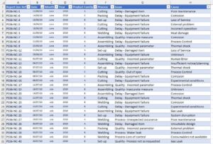
Figure 2. Example of Excel table, ready to create Pivot Tables and Pivot Charts.
Once you have completed the master table, you can use the Pivot Table functions to quickly summarise large amounts of data, and look for trends and relationships. The benefit of using Pivot Tables for non-conformance data is that you can set it to count frequencies of classifications, sort by frequency, and calculate running total in %, i.e., you can quickly calculate the data required for a Pareto Chart. Then using the Pivot Chart function, you can automatically generate a Pareto Chart. Once this has been set up you can quickly refresh the table and chart when new information is added to the master table.
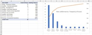
Figure 3. Example of using a Pivot Table and Pivot Chart to create a Pareto Chart.
Using the table shown in figure 2, you could also set up a Pivot Table and Chart to display the ‘Process’ and ‘Cause’ classifications. As the amount of information in your master table grows you could also filter your Pivot Tables and Charts by year and see how your improvement projects are impacting on your Pareto Charts.
If you’d like to learn more about creating Pivot Tables and Chart, then this YouTube tutorial is very handy.
Example of use in Health & Safety
One of the best examples I have seen of using a combination of the 80-20 rule, Stratification of Data, and Pivot Charts was during an H&S annual review. The H&S incidents were recorded in an Excel table, and had a number of classifications: Process, Department, Cause, Hazards, and Injury type. The Pareto charts were already plotted for the meeting. During the review nothing really stood out, there were no vital few. The injury types were the most promising, but the spread was, at best, 40% of the injury types made up 80% of the incidents. Then somebody suggested looking at injury position. When the charts were re plotted hand injuries stood out. Hand injuries accounted for more than 80% of the incidents. The types of injury to the hand were different, the main ones being burns, cuts and abrasions.
The priority for the following year was set to reducing the number of hand injuries. There were a range of projects to work on this:
- Find gloves that gave suitable thermal protection but had sufficient dexterity to do the activities.
- Provide jigs to hold the equipment when it was being disassembled.
- Standardise the tool kit for certain activities.
- Removing adjustable spanners.
- Installing ultrasonic tanks to remove some manual cleaning activities.
- Outsourcing bead blasting activity.
In the following year these improvements reduced the number of hand injuries by approximately 70%, and so was seen as a huge success.
Making a powerful Non-Conformance Management System
If you have lots of non-conformance data but don’t know what to do with it, then I hope this article has convinced you to do some deeper analysis. I’d recommend that you take a look at your current non-conformance reporting and identify how best to classify those instances. Then look at a way to tabulate, share and analyse that data. Most companies have access to Excel and it’s a convenient way to collate, collaborate and analyse your data. When you have identified your vital few then focus on these and make significant improvements.
If you are looking to develop a non-conformance management system and create a process improvement culture then take a look at our Process Improvement website page, or if you want quicker results then give us a call.